Search This Blog

Showing posts with label signs. Show all posts

Sunday, February 28, 2021

By the Numbers - Signal Number Plates

 I have previously discussed how railroads used milepost number places as an easy way to distinguish absolute from intermediate (ie permissive) signals.  Like pretty much every other facet of signaling I've covered these vary railroad to railroad and past to present so I figured I'd compile a guide to railroad number plates (which are distinct from Station Signs). 

Beginning with CSX, they use a white on black sign of medium side using a distinctive font that has been pretty consistent since the Chessie era.  The number is the milepost in tenths, ie without a decimal point.  If there is more than one main track is will be represented by a dash and the track number. Bi-directional signals use an odd-even system with one direction being the nearest odd 10th and the other being the nearest even 10th.  The choice of odd-even is not necessarily consistent across an entire line. 


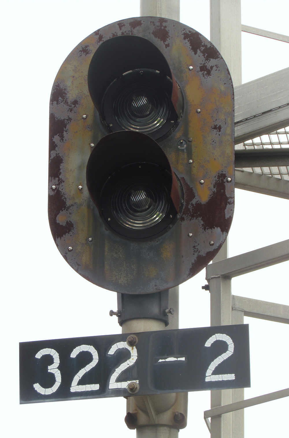
CSX also has a compact style that has appeared at various points around the system such as the Trenton Line and former RF&P.


Speaking of Conrail, they used what is perhaps the best number plate system with a whole milepost followed by the track number followed by a directional letter.  If there was only a single track the track number 1 would always be used.

Trenton Line MP 30 Track 1 North

PRR Main Line MP 124 tk1 West.  Note Conrail letters re-skinned by NS.

This type of signal would only appear on re-signaled territory, legacy signals, especially in Rule 251 territory, would just be a milepost number sometimes prefixed by a branch letter or direction.


NS honors the former Conrail system on former Conrail territory, but replaces the unit number plates with a modular type, similar to what the original PRR used.

On NS's other territories a milepost in 10ths with no decimal is used with the odd-even system in effect.

Until around 2000, former Southern territory used a large black on white sign and before that bare reflectorized numbers mounted to the mast. Signals not only use the odd-even system, but where there are more than one track, the tracks will use sequential odd or even 10ths creating a spread of 4/10ths per signal location.

Thursday, December 10, 2020

Signs! Signs! Everywhere a Sign! - Western Passenger Roads

 It's been a while since my post on Western Freight Railroads, that that's due to the unfortunate situation that many of the commuter agencies that do operate track between Chicagoland and the West Coast put little or no effort into their interlocking signs.  This installment will attempt to cover the interlocking signs of Metra, the South Shore, Railrunner, Denver RTD, Coaster, Metrolink and Caltrain. 


Starting with METRA, it directly owns and operates those lines that were cast off from freight railroads where there was little or no freight service and/or a general bankruptcy and abandonment.  This consists of the Rock Island division, Electric Division and SouthWest Corridor. In all these cases it appears that METRA just stencils a barely legible name on the relay huts with black paint.


There is an exception to this on the Milwaukee District lines that are are jointly operated between METRA and Canadian Pacific. In this territory interlockings are provided with white on Metra blue signs.


In the Chicago Union Station area, Amtrak provides Conrail style white on blue signs, although the font isn't quite right.


One might have thought the Chicago South Shore and South Bend would use some sort of heritage inspired sign, however this is not the case with plain white black on white stick mounted signs located at the interlocking limits.


With its strong roots in transit instead of traditional railroads, Denver's RTD just labels its signals with a lever number and milepost.


Albuquerque RailRunner uses cute ATSF inspired  black border signs at interlockings as well as maintaining a few originals. 


While  LA Metrolink has gone in with the METRA style of not giving a damn.


However across the county line, San Diego Coaster has gone all in for a period correct ATSF black border type sign.


Last and least we have Caltrain that has gone in for the stencil method.  However the stencils are larger and more legible and Caltrain also provides secondary signs with the full interlocking name.arranged in a vertical format at every interlocking entrance.


Well that finishes my coverage of railroad "station" signs in the United States.  If I am able to get enough references I'll see if I can do the same for Canada.

Sunday, October 6, 2019

Signs! Signs! Everywhere a Sign! - Western Freight Roads

Well it's time to cross the Mississippi and get this series finished up.  Today I will be exploring the signs of the Western freight roads.  Today this would be UP, BNSF, KCS, CP (former SOO) and CN (former IC).

We'll begin with the BNSF and you can't spell BNSF without ATSF.  Spoiler, western railroads had a big thing for white signs and black lettering so most of this post is going to be discussing all the ways one can do a white sign with black lettering and in my opinion the ATSF did the best job with white signs on black letters by adding a black border to the signs and a somewhat distinctive font. In this photo below we can see an example on the BNSF Raton Sub showing a single interlocking with a free standing ATSF style sign (probably from late in the ATSF era in the 1990s, and then more plain black on white BNSF signage mounted on the relay hut.


Elsewhere on the Raton sub we see a non-black border sign with the same ATSF font.


And finally we have a BNSF standard font.


On the BN side of the house we see a similar style of free standing black on white sign using a two post support.  On certain single track territories, interlocking signs would sometimes be replaced by a station sign similar to the one seen below. 


Note the variety of fonts.


Tuesday, February 5, 2019

Signs! Signs! Everywhere a Sign! - Eastern Passenger Roads

In Part 1 of my look at railroad station signs I covered the East Of Mississippi Class 1 freight railroads, NS, CSX, CP, etc.  Here in Part 2 I am going to be covering the passenger roads in the northeast, Amtrak, SEPTA, NJT, LIRR, Metro North, etc.  Surprisingly, as time has gone on the passenger roads have become significantly less labeled than their freight counterparts.  This could be due to cost cutting, a compact territory that makes getting lost less likely or simply a desire to hide operating practices from the general public. 

Amtrak operates its own trackage as part of the Northeast Corridor, Springfield Line, Harrisburg Line and, for a time, the Atlantic City Line.  Inheriting the infrastructure from bankrupt roads that would be later folded into Conrail, Amtrak would often just leave the old, typically Penn Central, sign in place.


The first thing Amtrak decided to properly brand were its manned interlocking towers where they
adopted a white on blue motif that would last through the present day. 


For remote interlockings constructed during the early NEC Improvement Project era, the Government dollars didn't really cover signs so Amtrak had to settle for stenciling on the relay hut.


The next standard that appeared around 1990 was a totally-not-Conrail white letters on blue background sign which also appeared on the Atlantic City and Springfield lines that were re-signaled at that time.


In the late 1990's Amtrak decided to add a touch of flare with a colorful sign that really showed off the old pointless arrow logo.  These appeared in just a few locations.


Meanwhile, further north Amtrak experimented with a white on black sign.  These are mostly seen on the Boston to New Haven segment and in northern New Jersey.


Which leads us to the present standard which I would call "low observable".  Not sure why Amtrak doesn't want to advertise it's interlocking names, but at least they kept the white on blue.


Sunday, November 11, 2018

Signs! Signs! Everywhere a Sign! - Eastern Class 1 Freight

Station signs are a uniform way of figuring out where you are on the railroad.  Sure mileposts work to, but important landmarks like stations and interlockings and block stations aren't always placed at whole mileposts.  Station signs aren't only a navigational aid, but in many cases a reminder device as many movement authorities are given between stations and if thew sign isn't obvious one is more likely to blow right by it. Of course every railroad is going to have it's own idea about what makes a good sign, some even have more than one.  Here in Part 1 we'll look at the eastern freight railroads, in Part 2 the western freight railroads and then in Parts 3 and 4 the eastern and western passenger railroads respectively.

Kicking things off,, Conrail use what I think is the most visually distinctive station sign in modern times using it's trademark blue and the Futura Bold font.  The signals were typically placed on either side of the main relay hut, although interlockings with two huts could support one each and of course special circumstances could lead to other mountings.  The standard signal was a reflective white lettering on a blue background.


However an alternate version existed that also contained the milepost.  This existed for a time in the late 80's and early 90's, but I'm not sure if ever fully replaced the regular signals. 


There was also this deluxe style sign with a white border and a different font that may have been a one off due to a rush order or something. .


Conrail used a slightly different sign for it's DCS block limits which was based on the PRR style of a vertical name surmounted red and yellow lamps..


Conrail's signage is still relevant today because after the split-up, Norfolk Southern decided to keep the style on all of the former Conrail territory (with a few exceptions early on).


Elsewhere, Norfolk Southern adopted the style of the Southern Railway with a green background and white lettering.  The signs are smaller than the Conrail variety and use a stick mount with one plate in each direction.  Some of these Southern style signs have appeared in Conrail territory, although the practice seems to have ended.


Southern era signs sometimes have a white border around the outside of the sign.


Moving on to CSX, CSX is a party pooper and doesn't really use station signs.  At interlockings it just stencils the interlocking name on the sides of the relay cabins.


 The policy applies even to new interlockings in Conrail territory. 


CSX used to use a Direct Traffic Control system with their own signage.  But DTC was largely replaced on CSX by DCS using mileposts.


The Guilford Rail System, currently known as Pan Am Railways, is known for painting some of it's rolling stock in a retro Pan Am inspired livery.  When it comes to station signs however, they can barely be bothered. 


A change in milepost prefixes has further degraded the artistic styling of the already bare bones signs. 


I have previously discussed interlocking names on the former Delaware and Hudson, and likewise, their interlocking signs reflect the period of Guilford ownership, although the association with Canadian Pacific did make things a little better.


The newly re-signaled interlockings have a more standard Canadian font, which I assume is bi-lingual in some manner.


Well that's all the Eastern freight railroads I have photos for.  Sorry Florida East Coast and Grand Trunk Western :-P